Home / bulletin board / bridging the gap between digital creativity and print precision
Bridging the Gap Between Digital Creativity and Print Precision

How to preserve colour impact from screen to press
One of the most common frustrations we hear from clients used to a primarily digital media workflow is: “Why do my screen colours look so much duller in print?”
And they’re not wrong. Vibrant web colours can lose their energy once they hit the printed page. This isn’t a flaw in the print process, but a natural consequence of how colours are rendered.
On-screen colours are created using RGB light (Red, Green, Blue), which emits light directly into the eye, offering rich saturation and luminosity. In contrast, print uses CMYK inks (Cyan, Magenta, Yellow, Black), which rely on reflected light. It’s a bit like comparing a lightbulb to a painting – two different visual sources with very different results.
But that doesn’t mean print has to look flat. With the right approach, you can produce stunning, vibrant print that lives up to the benchmark set by your digital marketing.
Understanding CMYK: the backbone of print
Whether using a lithographic or digital press, printing most often relies on the CMYK colour model. Each colour is built by combining different ink percentages from four plates, one for each channel. By layering these inks at varying intensities from 0% to 100% (known as tints), we create a full spectrum of printable colour.
However, CMYK and RGB are not direct equivalents. Digital designs require colour conversion before going to print. Without proper conversion, certain colours can shift dramatically, resulting in prints with undesirable dullness.
Spot colour inks: when you need an extra pop
For truly vibrant and brand-accurate results, especially when a specific hue is critical, spot colours can be a game-changer.
Unlike standard CMYK builds, spot colours are pre-mixed inks applied as extra separations. Think of them as the print equivalent of painting Dulux colours straight from the tin.
Why use them?
- Consistency: Spot colours ensure exact reproduction across different printers and substrates.
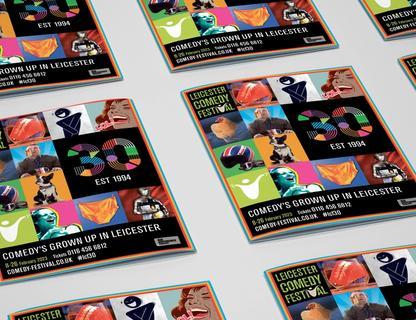
- Vibrancy: Especially useful for bright hues (like neon oranges, intense greens, or rich purples) that fall outside the CMYK gamut.
- Metallics and Fluorescents: These effects simply can't be replicated with standard four-colour process.
While spot colours come at a higher production cost, they’re often worth it for premium projects, brand-critical applications, or packaging that needs to stand out on the shelf.
From screen to press: best practices for vibrant print
Getting your colours right in print starts at the design stage. Here’s how to safeguard vibrancy throughout your workflow:
1. Convert colours early
Start your project in CMYK mode, or convert all RGB elements before progressing too far in your design. Applications like Adobe Photoshop and InDesign offer reliable conversion engines. This ensures you’re working with colours that are printable and reduces surprises during proofing.
2. Use clean CMYK builds
Strong colours typically require fewer inks. For instance, a vivid orange might use just 50% Magenta and 100% Yellow. Adding even small amounts of Cyan or Black (K) will mute the colour.
3. Eliminate low-percentage tints
Plates printing below 10% coverage often look uneven or “dirty,” particularly when used across large areas. When reviewing your swatches, zero out any low-percentage values that don’t serve a deliberate purpose.
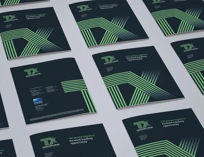
4. Choose the right paper stock
Glossy or silk-coated stocks reflect more light, making colours appear brighter and sharper. Uncoated or matte stocks absorb ink and soften colour. Always consider the paper’s impact on your colour palette.
5. Use Pantone process and spot colour books
These reference guides show how CMYK builds or spot colours will appear on coated and uncoated papers. If you don’t have your own set, ask your print supplier if you can see theirs, or request sample swatches for key spot colours.
6. Request a proof
Whether it's a digital proof or a full wet press proof, always review a sample before committing to a full print run. Proofs let you catch discrepancies and adjust accordingly before time and money are invested.
Your partner in print design and colour accuracy
Navigating colour in print can feel like a technical minefield, but it doesn't have to be this. At Reach Marketing, we blend digital-first creativity with deep print production expertise, helping our clients bridge the gap between screen and paper with precision and polish.
Need to make your next campaign leap off the page? Contact our friendly team of digital and print marketing experts today!